Case studies:
Seofriendly Solutions – Case Study.

Firstly, a few words from Mr
Tomasz Kołkiewicz, owner of
Seofriendly Solutions:
We provide services of website positioning and optimization. In general terms — we offer to make your website friendly for search engines.
I`m searching for help in creating from scratch or rebuilding our limping visual identity. It is probably obvious, but I`m looking for something unique, that would be immediately associated with what we do.
- Tomasz Kołkiewicz
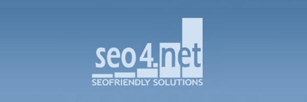
As mentioned above, the company already had a logo that it had been working under:

Former Seofriendly Solutions logo.
Tomasz was pretty attached to the original logo — especially to the concept of rising columns -
but as the company grew, he became convinced that its visual identity needs some refreshing.
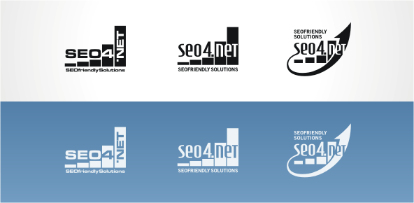
Therefore, we began with some tries of revitalizing the old mark. Several ideas of modifying the basic shape were created. I wanted to preserve the general feel of the original mark, but correct some flaws in its design and add a little bit more visual consistency:

Refreshment efforts.
I have to say that neither I, nor the client has been truly happy with the results. It seemed that those projects were too similar to the original one, and that we haven`t really reached any “new quality”. Even the immortal arrow-motif was not enough to save the case;-)
Creating a new symbol.
top
After initial — and failed — trials to revitalize the logo we started to search for something completely new. The priority for my client was to clearly indicate what the company does, preferably with the usage of rising diagram. Based on those assumptions I came up with a pair of new designs:

Sketches of a new logo.
The first sketch got rejected pretty quickly. The second one also didn`t arouse Tomek`s enthusiasm at first. Main objections were: visual chaos caused by the specific text composition and mixing up magnifying glass with the rising-columns motif (“excess of happiness”;-). Nevertheless, I liked the general idea and was pretty sure that this is an interesting direction to follow and explore.
With every round of modifications and upgrades Tomek`s doubts towards this concept were gradually withering away. Moreover, his suggestion to depict the magnifying glass with some more perspective added more dynamism to the logo:

Successive stages of modification.
At this stage we were practically sure that we have reached the right shape of the logo. Now we had only to pick fitting colors and put some finishing touches to some technical details...
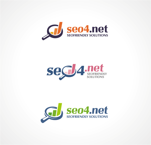
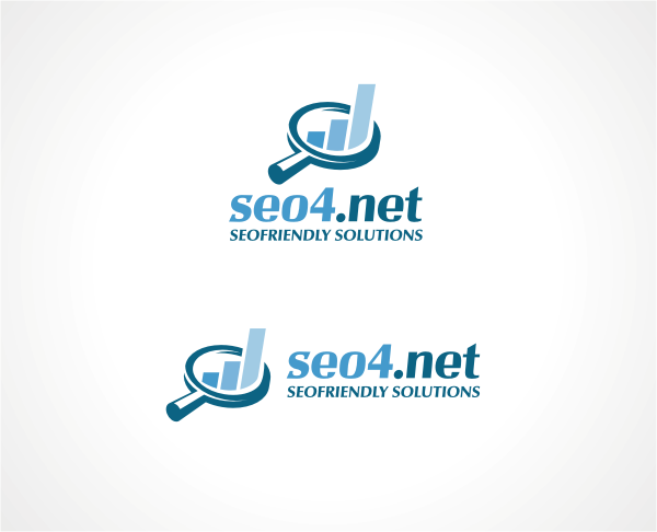
Below you can look up the final vertical and horizontal versions of the project.

Final result.
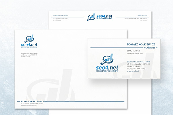
We have also created stationery to accompany the new logo:

Stationery.
I`d like to wish the very best to
Tomasz Kołkiewicz and his company, and thank not only for fruitful and very pleasant cooperation, but also for some viral marketing and a few cups of pretty nice coffee;-)
top
Case Studies »
(
Photo Tours Abroad,
Brand on Belief,
Trzech Kumpli,
Centurion Design,
Asun Asyar,
AVSystem,
ProSecura,
Królik,
Jadara,
Rexav,
ProfisBud,
Concretto,
Seofriendly Solutions,
WPNinja,
Lange)


