Case studies:
Lange Transport – Case Study.

Lange Transport is a company started up in 1996:
“Our business is about transportation of low-mass goods. We also provide large loading areas. Our target are clients, who want to send smaller loads, but don`t want their cargo to be mixed up with other loads (that can lead to lengthened delivery times, unexpected unloading troubles and multiple reloadings of their cargo). The idea is pretty simple: load the cargo — swiftly reach the destination — unload. No wheeling and dealing. We are fast and reliable, but we leave jobs like “Spain in 24h” to others. Our characteristics are: speed, security and common sense. What sets us apart from other companies is flexibility and availability. We cover all of European Union and, to a lesser extend, domestic transportation (Poland).”
— Norbert Lange, owner
In the beginning, the client wondered what should be the name the company would be working under. Until now there was no shortened version of its full name — “Przedsiębiorstwo Usługowe Lange Norbert” — and this form definitely doesn`t feel well suited for marketing.
Nevertheless the solution seemed quite obvious — Mr Norbert`s surname is pretty original, catchy, neat and shouldn`t give foreigners a hard time (Ruszel;-/). Moreover, it has already been working as company`s “nickname” for a while. What is more, it seems to have its etymological origins in words connected with length, distance, so it seemed perfectly suited for the job. Besides, it sounds much better than undying syllable-clusters like “LangeTrans” or “TransNor”...
I have been informed that the company already has a lot of trucks painted in specific fashion — red cabs and yellow trailers. Client made it clear that including this fact in a design process would be very desirable. Another important note was about the main place of logo`s exposition, and that would be on company`s truck trailers, which could be moving very fast in relation to observers. That made me put simplicity and clarity of the symbol as priorities.
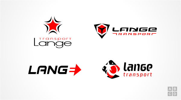
After gathering all necessary information I started working on the first sketches. I tried many different approaches, but none of them seemed right and on target. After those initial failures I decided to shift my focus to logotype, trying to get some interesting lettering that might inspire creation of appropriate symbol. Below you can see a part of the first batch of designs I presented to the client:

Initial designs presented to the client.
As I stated above I wasn`t really happy with those results. Although some of them appeared to have some potential for further development, the only thing I was satisfied with was lettering seen in version B. Apart from obvious reference to transportation through letter “N” (which effectively is an arrow), the whole logotype is dynamic, modern and at the same time harmonious and pleasant to the eye. This seemed quite appropriate for this enterprise. At this stage I was pretty convinced that this is the right way to go.
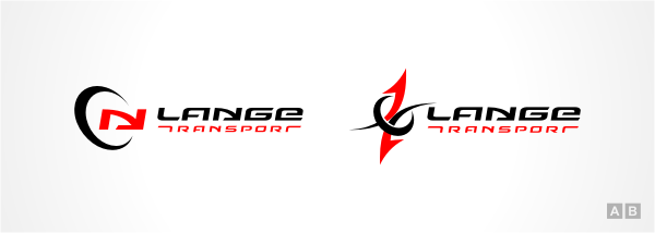
Even though I have already delivered the package of base concepts to the client it didn`t seem to me that I had explored all possible options. There was this bothering feeling that I haven`t yet found what I`ve been looking for. So I sat down to another round of sketching. Here are another two graphics that came out of it:

Next batch of logo concepts.
Graphic symbol of the first one is based on the characteristic letter “N” used in the logotype, but adding the classing “
swoosh” turned out to be a bit trivial and abstract “solution”.
The second one uses equally classic arrow, but this time they seemed a bit more appropriate than usual. However, this was not enough to make me feel good about those designs...
Right track and the final destination.
top
After constructing all of above graphics (and many more) it occurred to me, that what I`m looking for is a symbol that would mix together the geometric simplicity of logotype, some abstract representation of a package and its transportation (this obviously calls for some usage of an arrow shape).
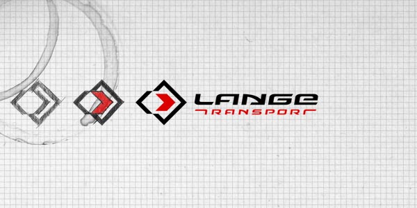
With those ideas in mind I turned back to the drawing board. The starting point was a grid, which helped to secure appropriate geometric relationships across the whole symbol. It seemed that with every step I was drawing nearer to the solution I had been searching for:

Symbol`s evolution.
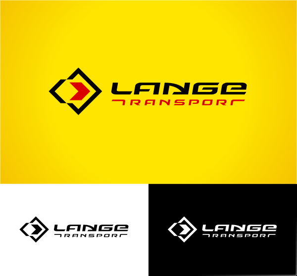
The last sketch is pretty much the same as the final shape of the symbol. Both me and the client were very happy with the overall result — logo has fulfilled all of project`s principles: simple form, characteristic, legible, modern, dynamic and clearly suggesting company`s field of interest.

Lange Transport logo.
top
Case Studies »
(
Photo Tours Abroad,
Brand on Belief,
Trzech Kumpli,
Centurion Design,
Asun Asyar,
AVSystem,
ProSecura,
Królik,
Jadara,
Rexav,
ProfisBud,
Concretto,
Seofriendly Solutions,
WPNinja,
Lange)


